ART DIRECTION
NEXBANK
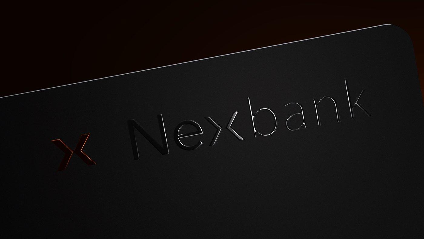
Nexbank is a near-future, mobile-first banking proposition built around a single object: a black metal card that thinks. The experience is designed primarily for mobile, with a dark interface system connecting multi-currency management, activity dashboards, services, pricing and business tools. The visual language rejects the friendly-pastel fintech trope and pushes towards quiet technology — embossed metal, micro-typography and a precise orange signal.
THE APPROACH
EVERY FRAME EARNS ITS PLACE.
Nexbank is a near-future, mobile-first banking proposition built around a single object: a black metal card that thinks. The experience is designed primarily for mobile, with a dark interface system connecting multi-currency management, activity dashboards, services, pricing and business tools. The visual language rejects the friendly-pastel fintech trope and pushes towards quiet technology — embossed metal, micro-typography and a precise orange signal.
DELIVERABLES
- Brand identity01
- Card design & CGI02
- Mobile product UI03
- Responsive interface system04
- Marketing site05
- Motion design06
- Product storytelling07
HIGHLIGHTS
QUIET TECHNOLOGY
No emoji, no gradients-on-gradients. The card does the talking; the UI just frames it.
ONE WARM ACCENT
A single orange signal across every surface — typography, CTAs, glyphs — to keep the system focused.
EDITORIAL UI
Marketing surfaces read like a magazine spread before they read like an app.
VISUAL GALLERY
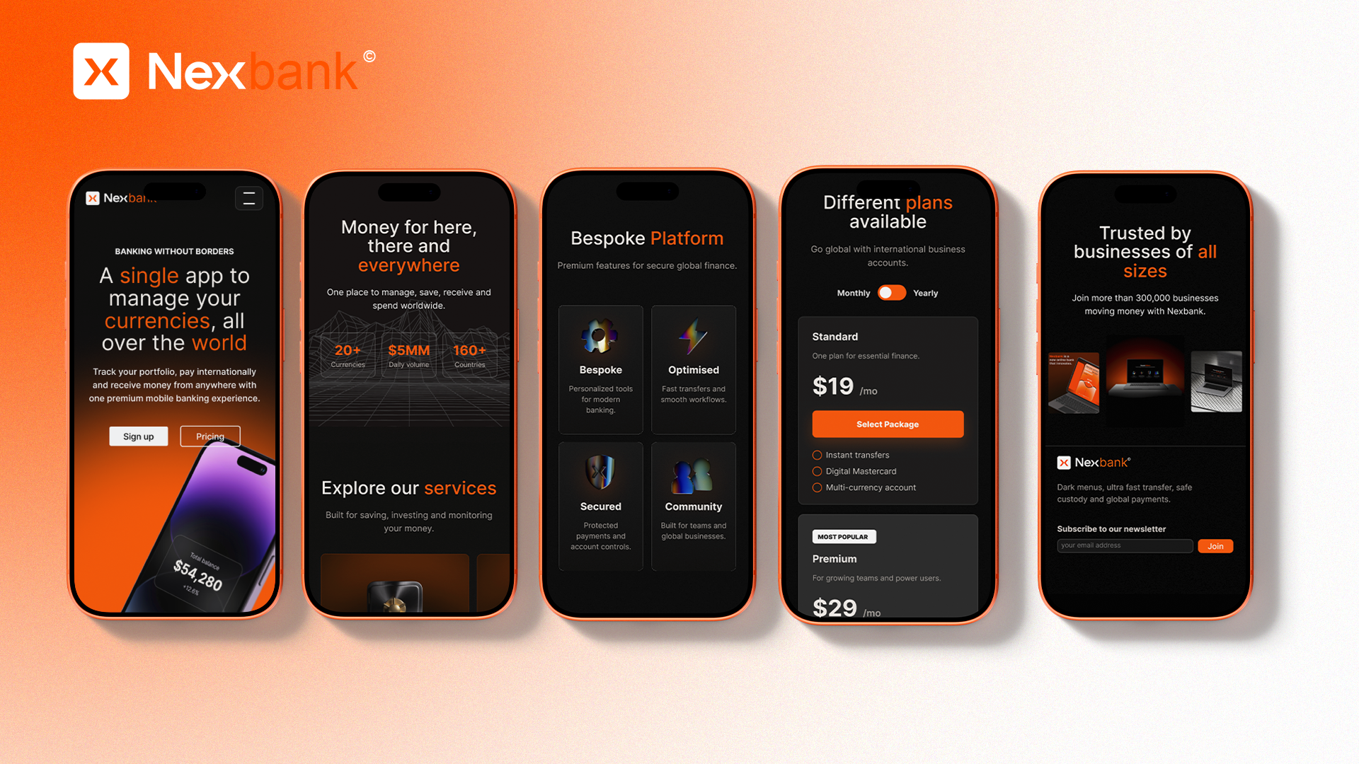
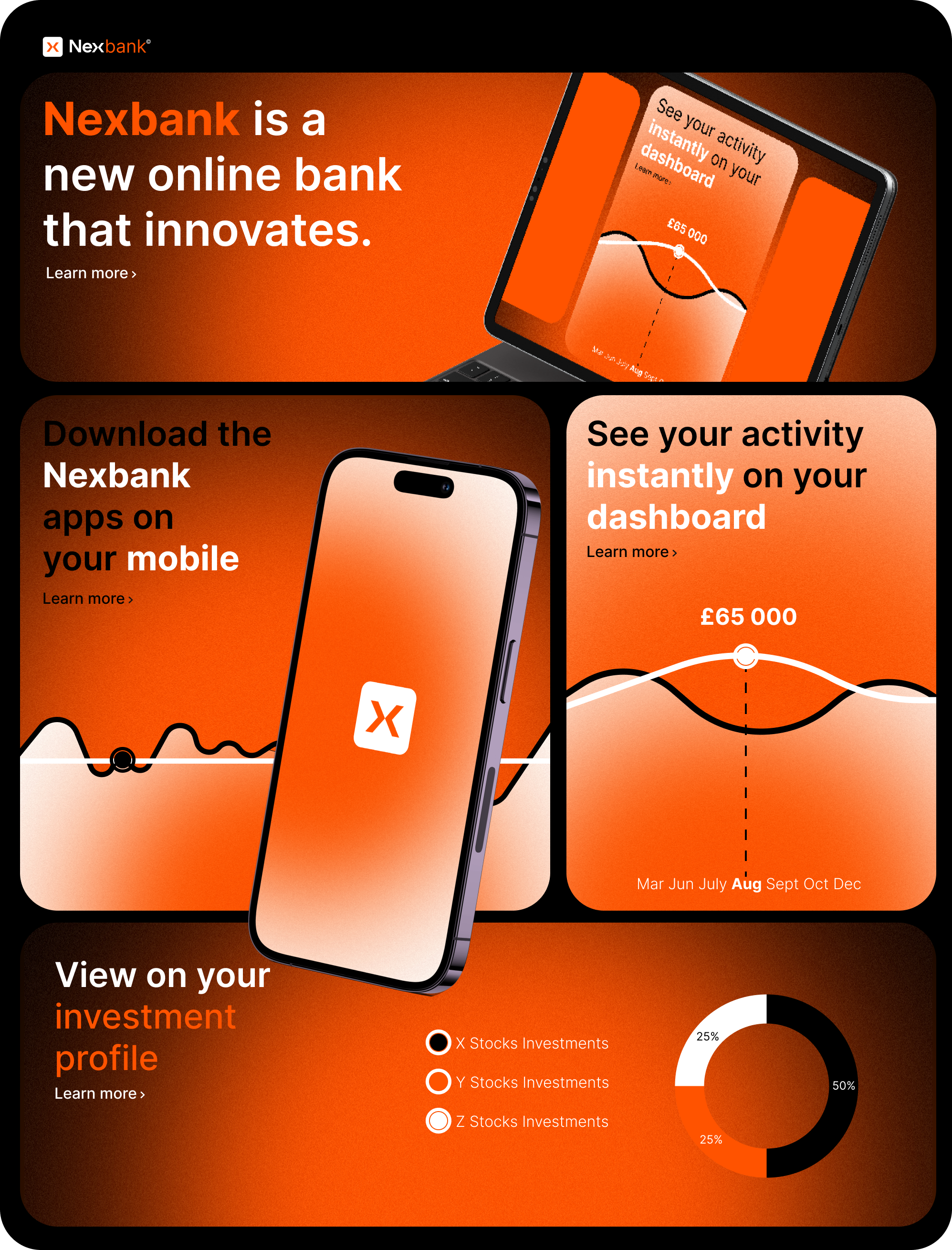
Mobile dashboard — account activity, app access and investment profile modules.

Card picker — sequel to the Apple Card moment.


Global stats — 20+ currencies · $5MM daily · 160+ countries.
Motion Design
To bring the Nexbank ecosystem to life, I explored motion design as an extension of the brand experience. From product presentations to animated storytelling, these explorations focus on rhythm, clarity and premium digital interactions.
NEXT PROJECT
04
NIKE WILD RUN
ART DIRECTION